Located in Sun Valley, Idaho and named after the founder’s hardworking yet stylish grandfather, Earl’s Authentics is a high-end menswear retailer that offers a curated assortment of premium brands with a focus on durable, domestically manufactured goods.

Client: Earl’s Authentics
Agency: Superbase Creative
Project: Creative Direction, Brand Strategy, Logo Design, Product Design
Design: Nathan Warner, Kelly Williams
Photo & Video: Connor Bunderson
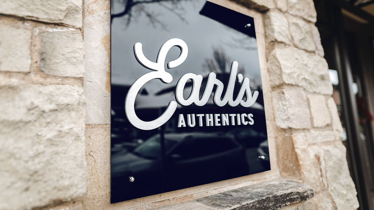
From hand-stitched woven shirts to American-made selvedge denim, Earl’s knows their clients prefer product that not only looks good but will outlast cheaply made department store apparel. This combination of ruggedness and style affirm the idea that good product becomes even better with age.

Earl’s approached Superbase for help with designing a new brand identity and providing overall creative direction. They told us of their vision for an enduring, handwritten logo that would complement a wide range of styles while still attracting those with discerning tastes. Our design process originated with an authentic passion for Earl’s ambitions before we began sketching dozens of different letterforms and wordmark iterations until we arrived at a signature-like logo that looks great in a variety of applications including exterior signage, apparel, and packaging.
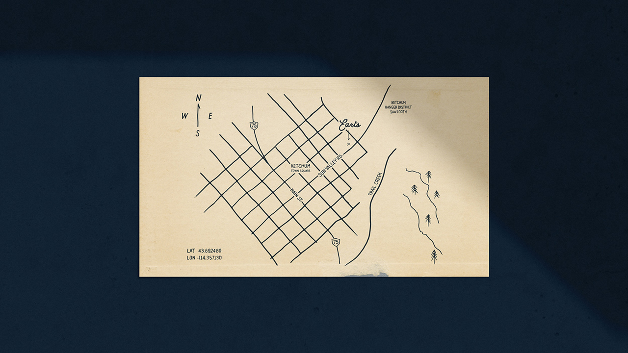

We began this project by working closely with Earl’s to complete our proprietary Brandscape Discovery process in order to gather detailed information about who they considered to be their customer, other brands that exist within their industry, complementary brands, and how they described the competitive landscape. But it wasn’t merely data that informed our creative decisions. These findings simply served as a backdrop to help direct our design process.

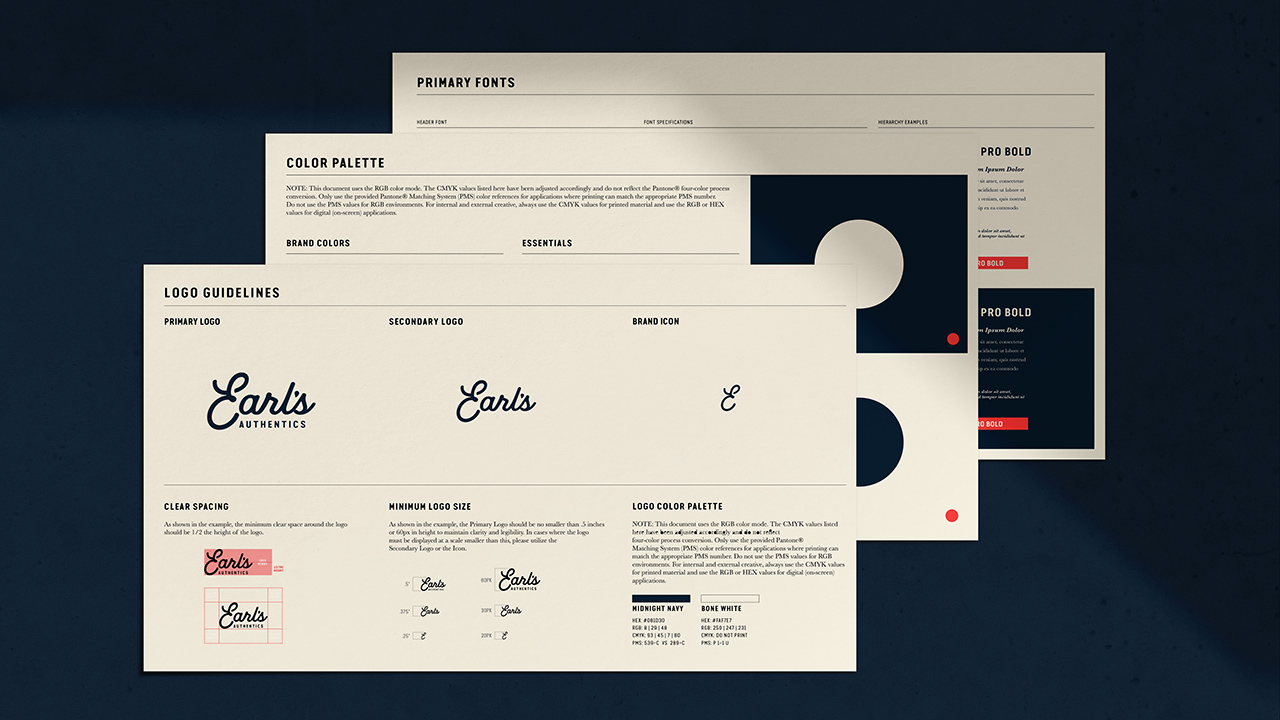
While developing the Earl’s Authentics logo, Superbase also created a set of Brand Guidelines that help the client maintain uniformity in all of their subsequent branded material. Brand Guidelines are essential for companies that work with multiple service providers as these guidelines ensure the brand is always expressed consistently. Detailed directions on logo usage, typography instructions, and color formulations with Pantone Matching System™ references are included.

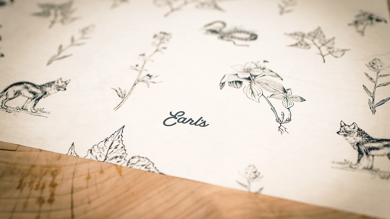
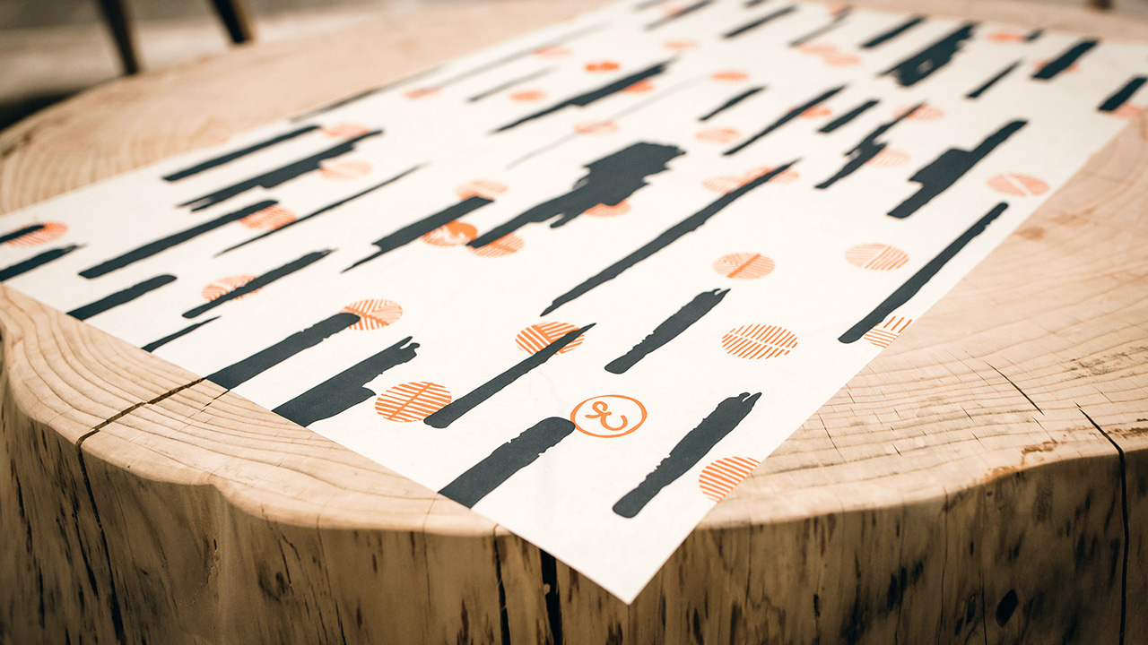
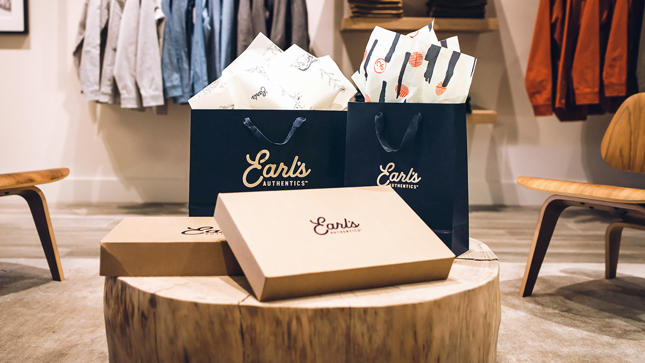
To accompany the Earl’s wordmark, SUPERBASE developed two custom patterns to be used in packaging and environmental design.
The “Life Wild” print features a repeating pattern of various plants and creatures native to the Ketchum area. Dogwood, Birch Leaves, and Castilleja (or Indian Paintbrush – the namesake of the Earl’s brand red) are juxtaposed alongside slightly more ominous figures that are also found in the region such as the stealthy Red Fox and the Western Rattlesnake. The rattlesnake is an enigmatic and sophisticated creature that brings a subtly masculine touch to the floral print. One reason for incorporating the snake is the interesting contrast between the cleverly predatorial serpent and the passive plant life. The understated correlation with the snake-like coils of the “E” in the Earl’s logo also creates an additional layer of interest.
“Birch Camo” is a custom print that features an array of red coin-sized circles overlaying a camouflage-like pattern inspired by the birch trees found in meadows throughout Sun Valley. As part of an art gallery tradition said to have originated in America in the 1970’s, small red dots are placed next to works of art that have been sold or are otherwise unavailable for sale at the opening reception. Additionally, red polka-dot prints have a special connection with the mountain classifications in professional road cycling. Riders in international road bike tours are awarded a white jersey with red dots for reaching mountain summits first. In the Tour De France, the rider awarded this jersey is named the Gran Premio della Montagna, or King of the Mountains. These red dots and the abstract birch print combine to create a classy repeating pattern perfect for fabric prints, retail tissue paper, etc. The colors Castilleja Red and Midnight Navy were both formulated exclusively for Earl’s Authentics.

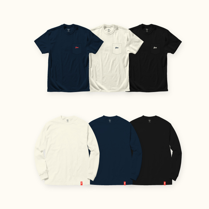
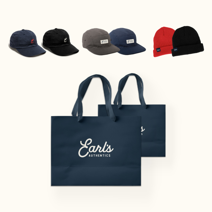
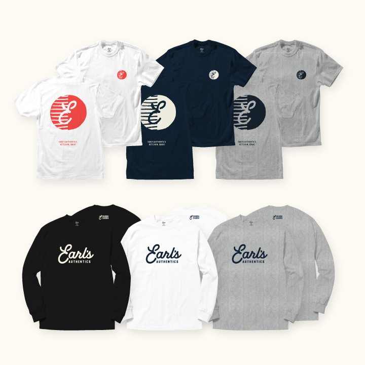
In addition to carrying renowned menswear brands, Earl’s wanted to offer their own label and asked Superbase to design a line of Earl’s branded apparel and accessories. The Earl’s Basics collection is an assortment of premium pima cotton t-shirts and quality headwear with subtle branding.
