Meet Niima

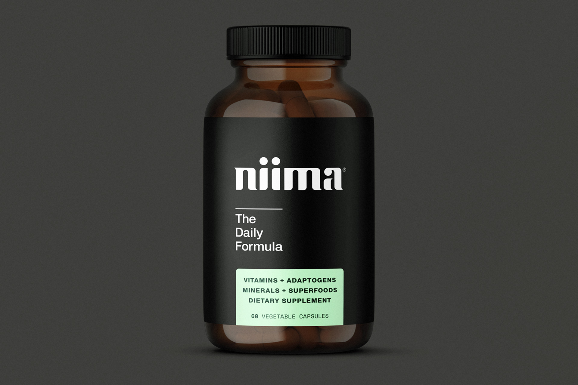
Niima by Niima Wellness is the only one-a-day nutrition supplement formulated to sharpen focus, minimize stress, provide immune support, and boost energy naturally. The product is designed for action sports athletes and creators who have become understandably disillusioned with the complex and chaotic gimmicks often prevalent in the nutrition supplement industry.


Client: Niima Wellness
Services: Brand architecture, naming, logo design, brand system, packaging design, marketing strategy, content creation, creative direction
Creative Director: Kelly Dee Williams
Design: Julie Joanny, Luis Moscrip, Kelly Dee Williams
Video: Jared Spieker, Jeffrey Mensch
Photo: Keegan Rice

Strategy & Design

Niima’s primary purpose is to make daily nutrition simple to understand and easy to take every day. They are passionate about developing products that help riders sharpen mental focus, boost energy naturally and improve recovery… all with a single capsule. Niima provides real benefits from food-based ingredients.


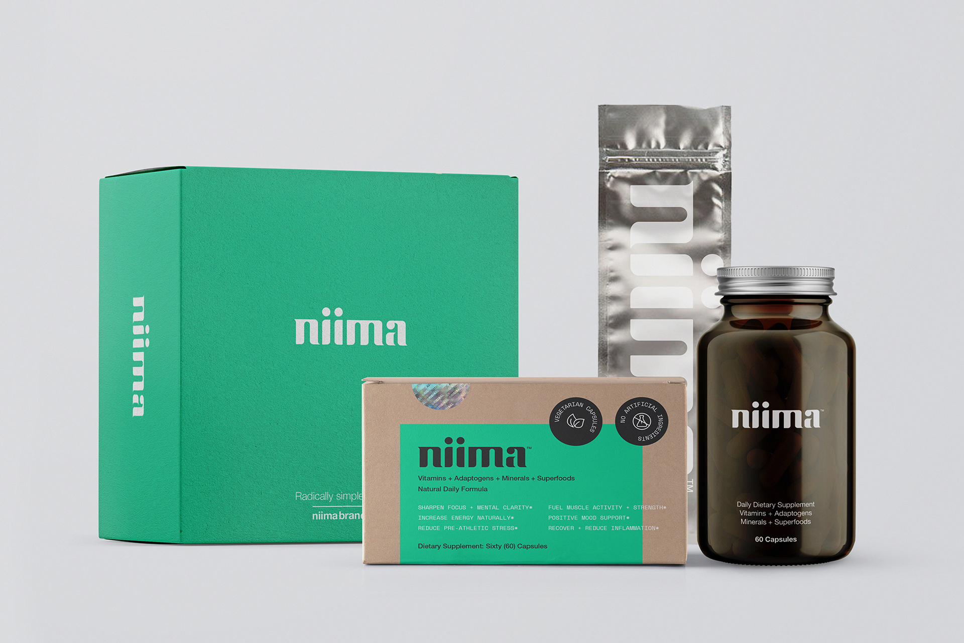
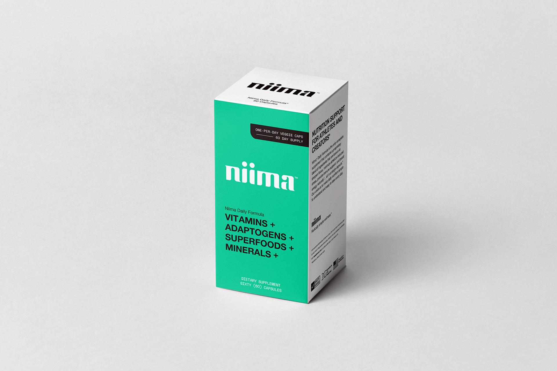
After exhaustive research of the nutraceutical brandscape, it was obvious that most companies followed a similar set of rules with their overall design and we wanted the Niima brand to stand out from the crowd. So in the spirit of Niima’s “Naturally Defiant” ethos, we aimed to create a completely different packaging experience that elevates the brand without the use of plastic.

Brand Naming

Before this innovative wellness brand even had a name, they approached Superbase to help with their overall Brand Architecture and Creative Direction. The name Niima was originally intended to just be the working title for the brand and was simply derived from the last four letters of the word “vitamin” when spelled backwards (n-i-m-a). During the research and development phase of the first product, we ended up calling it “Nima” so frequently, that the name eventually evolved from part-time placeholder to the full-time name of the company.


Want a more inspiring version of that story? Niima (or Nima) is a Tibetan name which means “the sun”. Just as the sun provides life-sustaining energy to the planet, Niima provides nutritional energy and other wellness products to humans who are looking to perform their absolute best.

Brand Identity

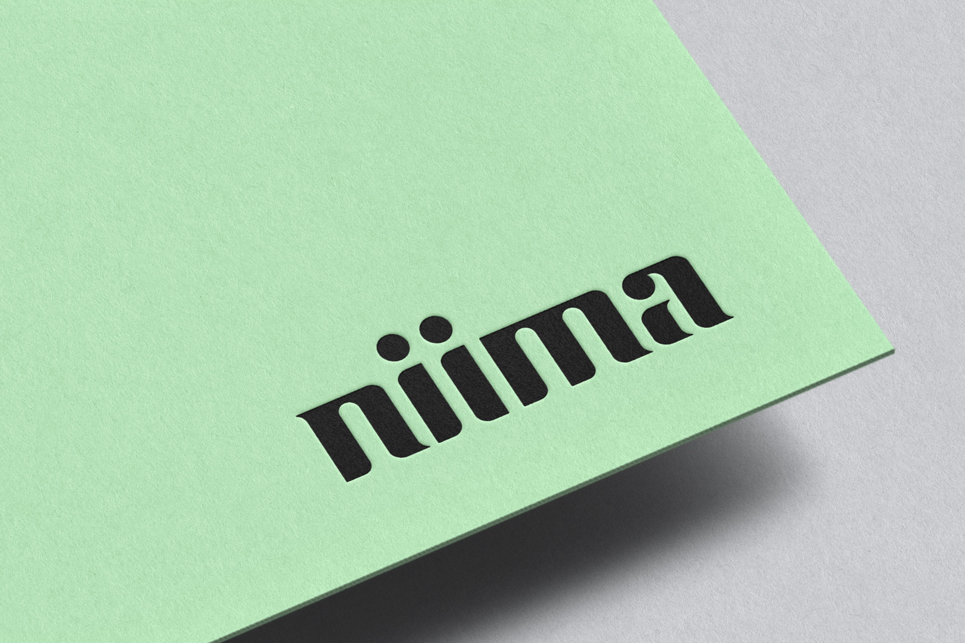
When designing the Niima logo, we wanted it to convey a feeling of smooth, flowing lines while maintaining a bold enough wordmark that it could be easily seen and recognized from afar. The resulting brand identity has been described as a combination of futuristic and organic, and has achieved one of our key goals: create the first vitamin brand with a logo to be spotted on a skateboard, surfboard or pair of skis. Biingo!

Go-To-Market Strategy

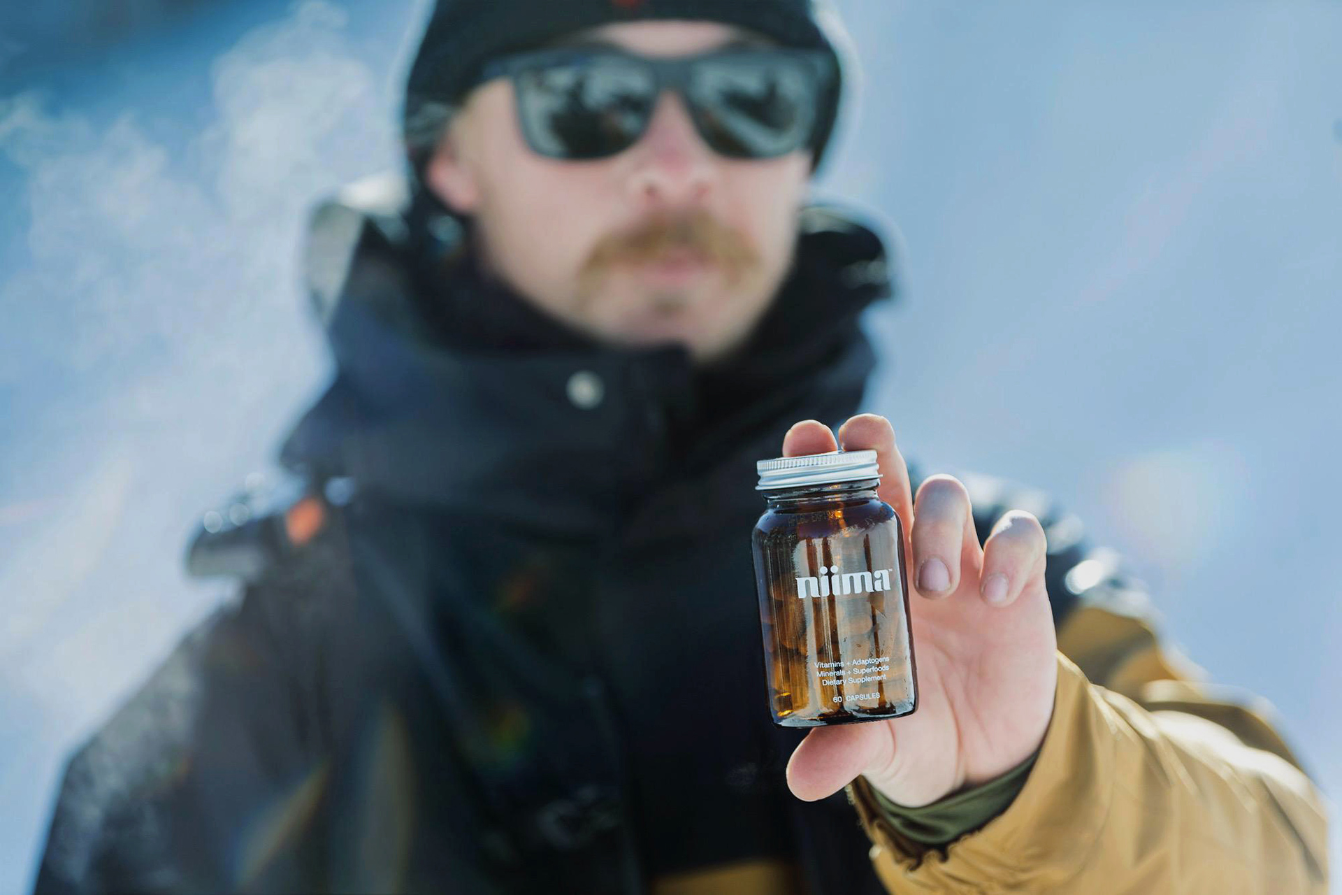
With a focus on social media storytelling, supporting a community of athlete and artist ambassadors, and eventually expanding the brand into other complementary product categories, Niima embodies a degree of humble confidence that is exactly what the customer has been looking for.


Visit niimabrand.com to learn more.

“Superbase has been hugely valuable in regard to branding and design. I’ve been impressed by their commitment and level of detailed results. And I appreciate their positive energy and organized approach.”


Josh Loubek, Co-Founder of Niima™