PagePLUS
Let's bring some energy to this sleepy owl.
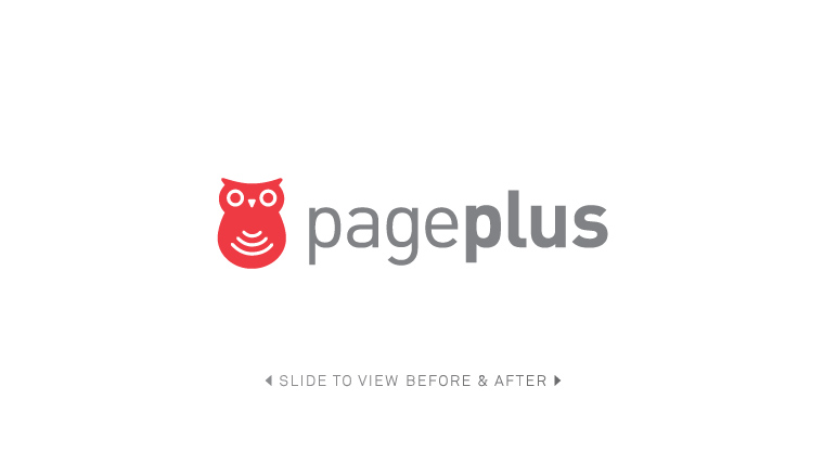
PagePLUS is a wireless provider with national coverage on one of the largest networks in the country. They began back in 1993, and as their name implies, they offered prepaid pager and cellular phone services. Their matryoshka-like owl logo was arguably forgettable and didn’t communicate the high performance nature of this cellular service brand. To solve this we undertook the process of redeveloping the brand identity to better articulate a more modern and competitive wireless company.
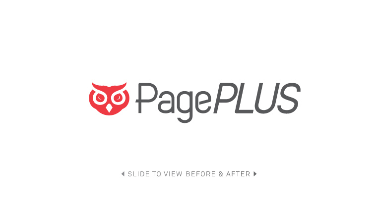
Recommendations included transitioning the name from pageplus (in all lowercase characters) to PagePLUS, placing more emphasis on the additional services that they became known for – which were far beyond the outdated paging services of yesteryear. Additionally we experimented with dozens of different owl logo variations, eventually arriving at this sporty icon combined with a newly designed wordmark.
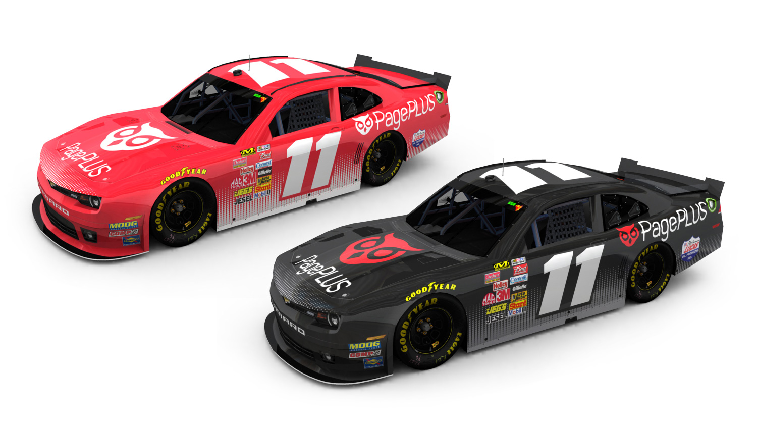
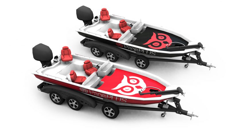
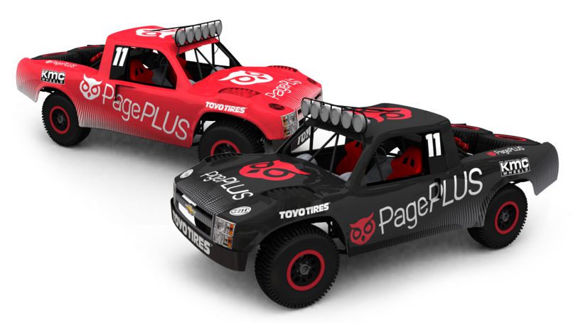
It was also requested that an overarching campaign that spoke of high speeds and reliable connections be created to introduce the brand to a new market. To accomplish this we proposed the idea of partnerships with various racing and fishing organizations as well as establishing brand ambassador relationships with professional athletes in this field.
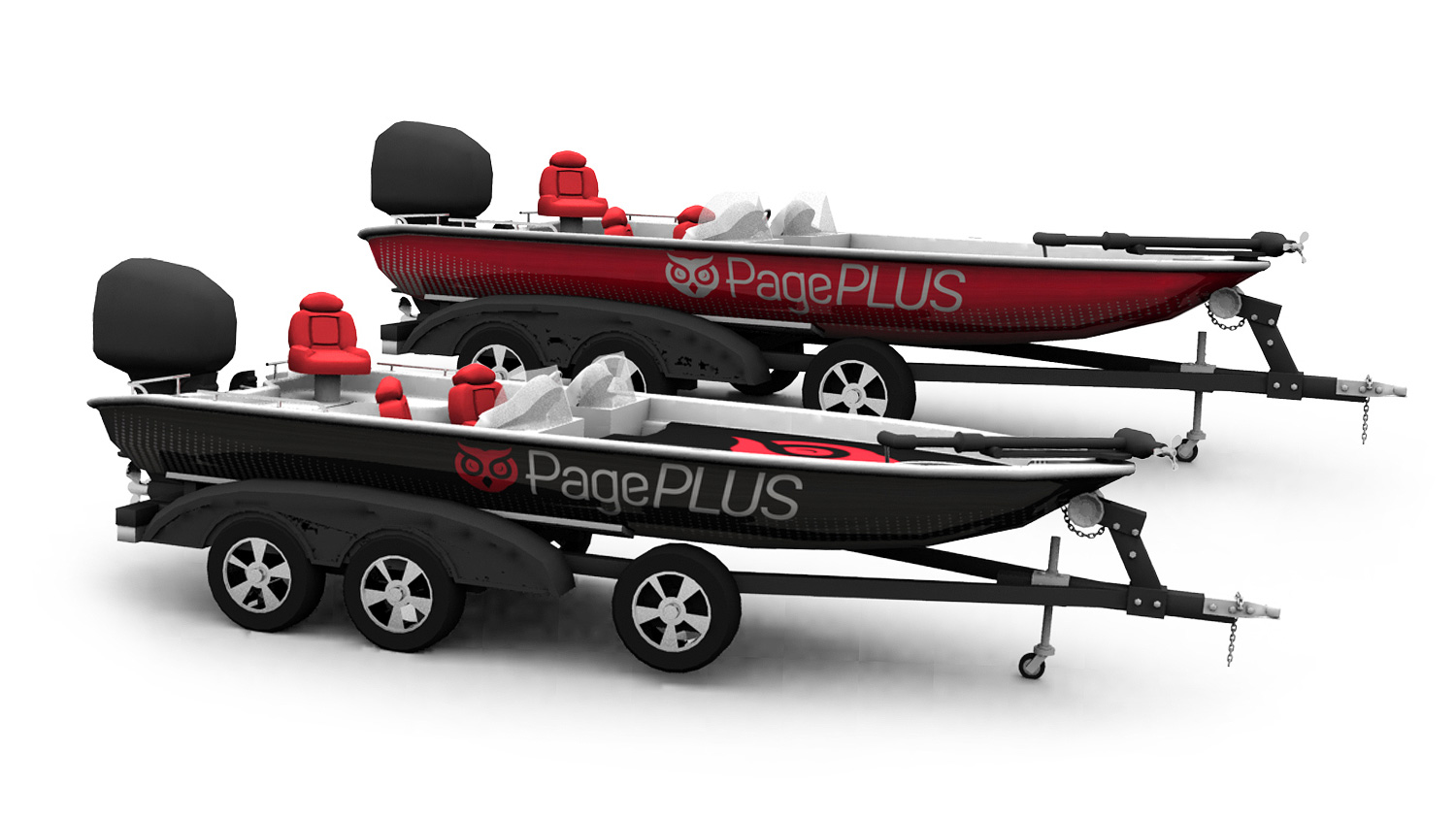
Here you can see various applications of the new brand on sponsored racing vehicles, punctuating the slogan Everywhere. Fast.
Partner Agency: 85SIXTY
3D Modeling: Tyler Tucker
Creative Direction: Kelly D. Williams
Graphic Design: Superbase
Services
- Brand Identity
- Graphic Design
- Marketing
