Wend Waxworks
A surf wax company enters the wintersports market and dominates.
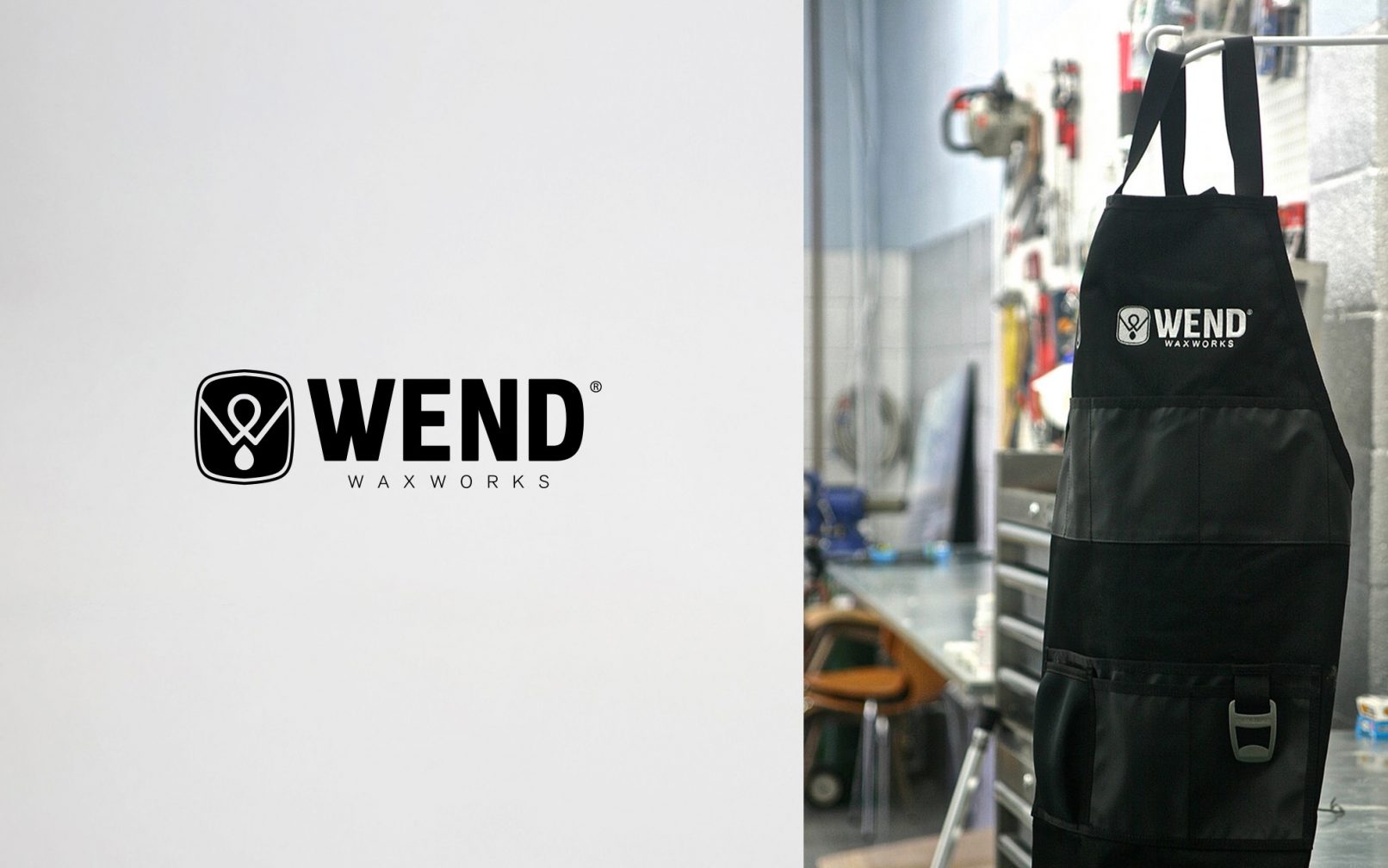
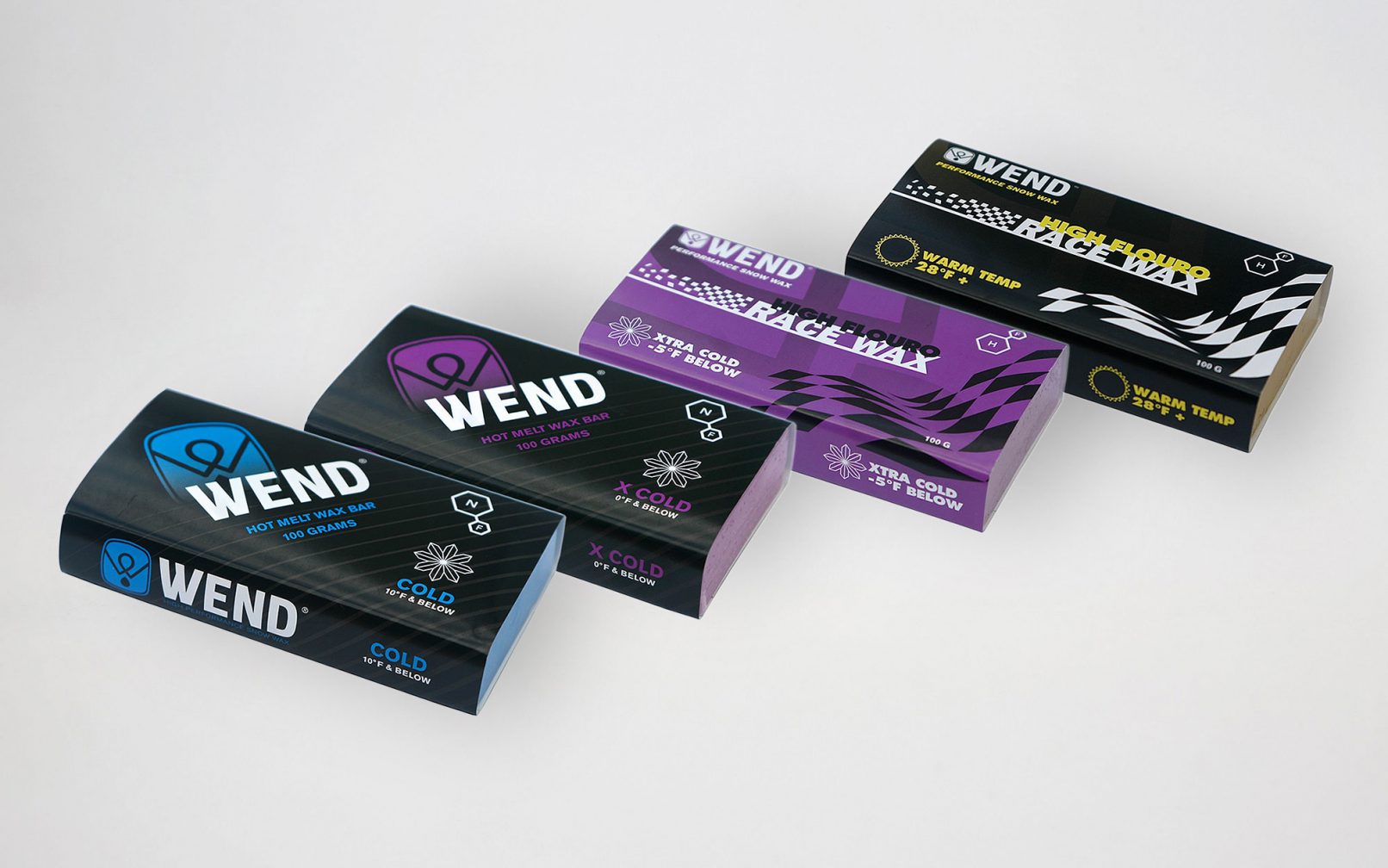
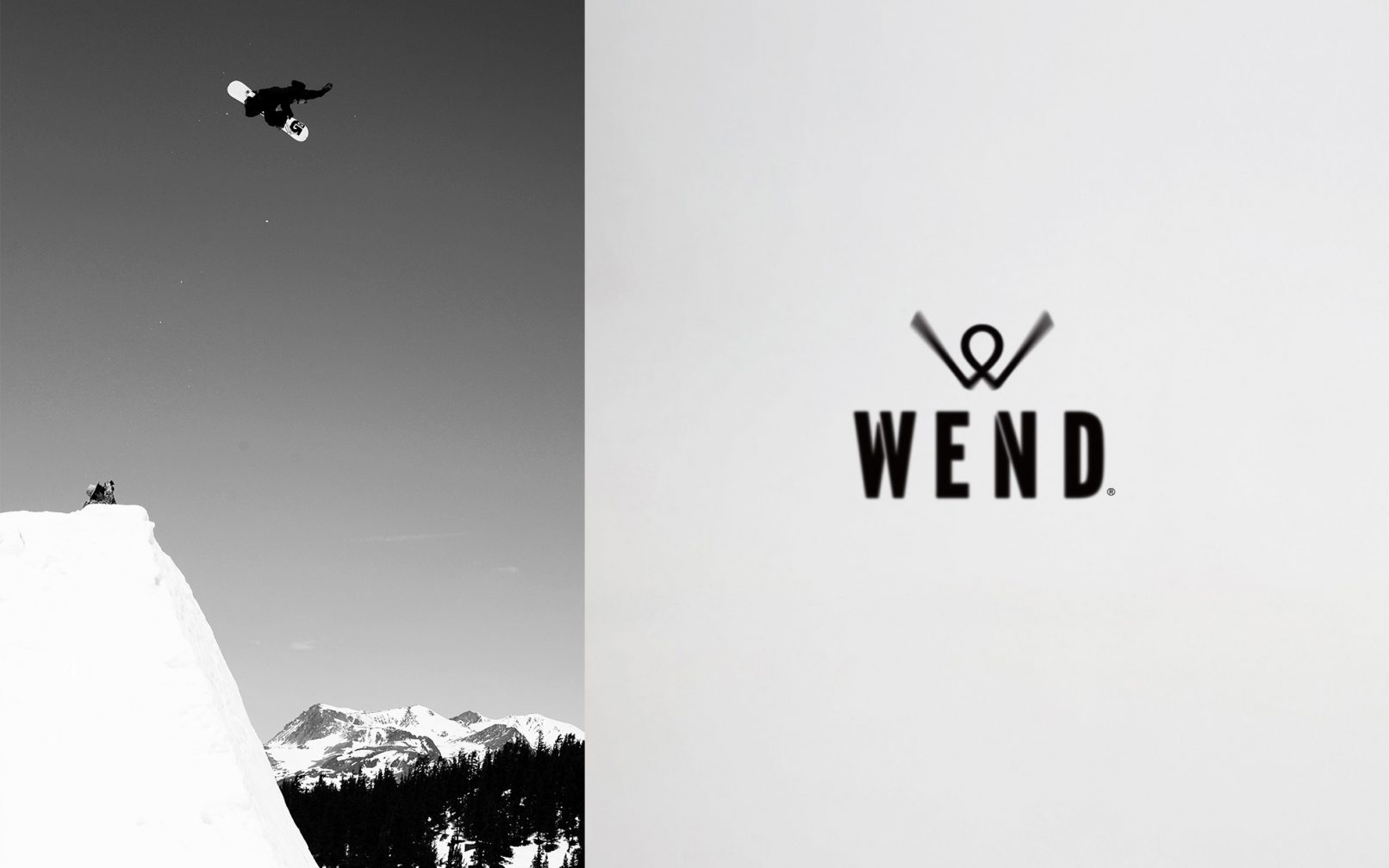
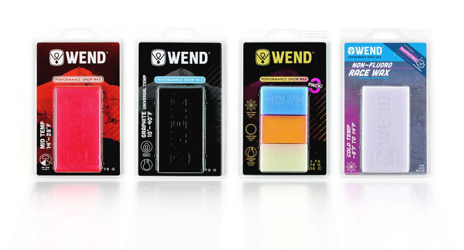
Back in 2012 we were commissioned to design the debut brand identity for this new company and conceptualize the initial packaging artwork for a product that would be relevant across multiple demographics within the ski and snowboard industries. Building upon a performance-focused foundation, our objective was to design a logo that was bold and simple while also including subtle symbolism that spoke to the product category. We began with the wordmark, making sure to select a typeface that could remain compact yet legible on small stickers, in product molds, or when being viewed from a distance. After finalizing the core wordmark, we proceeded with the “W” icon. The goal was to create a symmetrical icon styled like a jagged mountainscape that also resembled the process of hot-waxing skis & snowboards, which is where the “droplet” comes into play; if you look closely you may recognize these subtle features.
Creative Direction: Kelly D. Williams/Superbase
Graphic Design: Ryan Stephens, Kelly D. Williams
Photography: Dean Blotto Grey
Project Year: 2012
About WEND: With over four decades of product development and testing from the laboratories at Wax Research, WEND offers performance snowboarding and ski waxes that enable riders to experience unmatched speed and performance. Their unique and environmentally-conscious formulas have been developed with the assistance of technicians in the US Olympic Training Center, leaders in the field of Sports Science, directors of the USSA, and a legendary team of wintersports athletes. Comprehensive testing is continuously conducted in World Cup wax rooms, the formidable peaks of Alaska, summer training camps, and races around the world.
Learn More: Contact Superbase Creative to begin a conversation with us about how we can help your brand becoming unignorable.
Services
- Branding
- Graphic Design
- Consulting
- Identity
