Behind the DVS Rebrand
DVS is a global footwear brand that was founded in 1995 by the Dunlap brothers and Tim Gavin. It has always remained dedicated to offering premium skate footwear. This re-brand project occurred in 2013-2014 and was led by Creative Director Kelly D Williams.
The initial logo was created by early DVS designer Marty Shadoan approximately twenty years ago. It was a memorable icon of the ’90s and shared a very similar aesthetic to many other skate, surf, and snowboarding brands of the era. Kelly agreed that the logo didn’t need a complete overhaul, but it did need a subtle update that brought it up to speed with contemporary design principles and ensured it could withstand the test of another twenty years and beyond – especially in an industry where trends are constantly changing.
Their original icon was quite sheered, slightly uneven, and had extremely thin points at each end of the shape that proved difficult to execute properly in embroidered and molded applications. The first icon was also considered to be a somewhat confusing symbol, causing a unanimous “what is that?” response. Furthermore, this icon had been reinterpreted over the years as it circulated around the marketplace. Nearly a dozen different iterations of the logo existed, and even internally there was confusion as multiple versions lingered around the organization, each with only slight differences. This is why we felt it was imperative to update the logo and create a decisive Brand Guide to serve as a standard for all Marketing efforts and Product design.
Form & Function
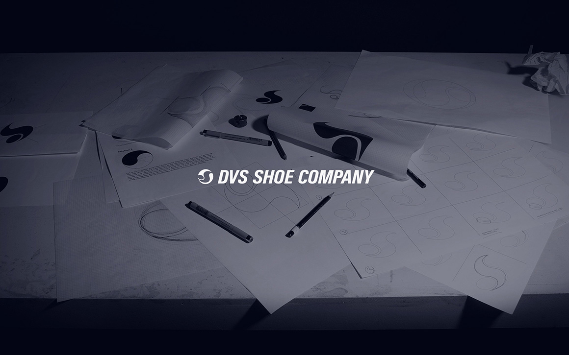
The new logo is obviously built upon the same concept as the original one, but significant effort was put into finding the best balance and curvature of the design. In order to make the icon more immediately pleasing to the eye, Kelly re-drew the shape by hand (over 35 times) before digitizing it to withstand extreme downscaling while ensuring it could be easily executed across different manufacturing processes. These subtle changes are meant to create an overall more attractive and consistent logo. It was a way that the brand could be updated and refreshed while not confusing the customer. The new logo package looks and feels new, but intentionally doesn’t seem like a diversion.
The Package
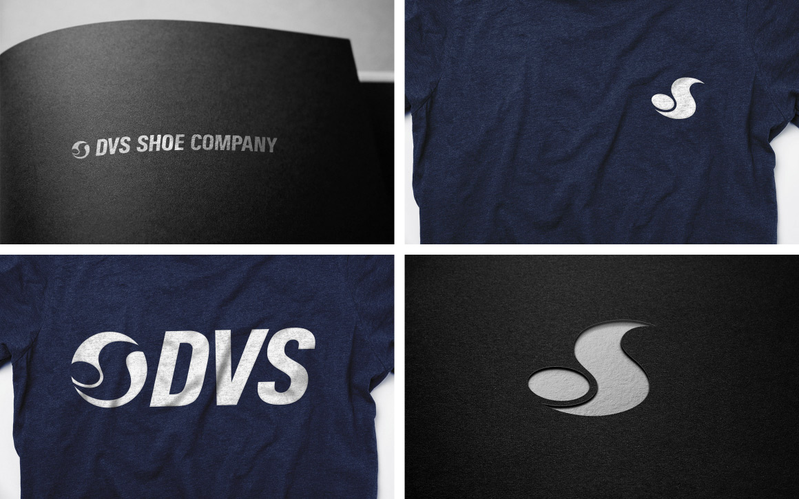
Along with the new “OG Icon” logo, secondary and tertiary logos were created to complement the diverse range of products and sports categories that DVS is known for. The icon serves as the foundation for the brand, while the wordmark variations allow for further clarity and functionality when needed.
Some may argue that you shouldn’t have more than one logo, however in this day of mobile-first design and with a product range as diverse as DVS, it is very appropriate to consider all of the different applications of a logo and how they might be optimized by having a well-planned logo suite of different but corresponding logos. As a branding agency, we have to consider how the brand is represented on stickers, footwear, embroidery, video, business cards, vehicle wraps, websites, t-shirt graphics, micro labels, social media avatars, and a 40-foot long tour bus can all benefit from having a cohesive yet adaptable brand design.
This project wasn’t about a single logo, it was about creating an identity that meets the needs of multiple demographics and has the flexibility to remain strong in an endless array of environments.
View more work done for DVS here »


